Instagram Carousels for Growth: Indian Creator Guide

Carousels are the posts where someone swipes through several photos or videos before they reach the end. For many Indian creators and small brands they are the most useful format on Instagram for teaching, showing a process or giving a short list of tips. They also give you a clear signal of what your audience values, because saves and shares tell you more than a quick like does.
This guide explains what a carousel is, how many slides to use, how to plan one around a single idea, and how to read the numbers after you post. It is practical and does not promise any reach or followers. Use it as a checklist for your next post.
What counts as a carousel on Instagram
A carousel is one feed post that holds more than one photo or video. People open it, swipe through each item and see the whole set as one post. Instagram's Help Center says you can share up to 20 photos and videos as a single post from the app and the web. Carousel posts are not Reels. Videos inside a carousel do not appear in the Reels tab, so keep that in mind if you want reel-style discovery.
Two settings to know before you start:
- Orientation applies to every slide. You choose square, portrait or landscape once for the whole post, and you cannot mix shapes in the app.
- You can add one location and one caption for the whole post. You can tag a person on each slide separately.
If you schedule posts through a third-party tool, check its limit first. Some tools and publishing routes allow fewer slides than the app does, so a 15-slide plan can be cut short without warning.
Why carousels help growth, and where they do not
Carousels can help growth for three reasons. They give a reader a reason to stay on your post for longer. They suit content people want to save for later, such as checklists, step lists and comparisons. And they make a topic easy to share with one friend who needs that exact answer.
They do not help when the slides are weak. A carousel with five slides of padding and a blank last slide is worse than a single good photo. The swipe only works when each slide earns the next one. If your audience scrolls past slide one, the rest of the post is wasted, so the first slide needs the most care.
Carousels also do not replace consistency. One strong carousel helps a little. Several useful carousels across a month, written for the same audience, build a body of work that people come back to. Think of each post as a small lesson, not a one-off ad.
How many slides to use
There is no magic number. Pick the number of slides the idea needs and stop there. For most Indian creators and small shops, these ranges are a sensible start:
- Three to five slides for a single tip or a quick before and after.
- Six to nine slides for a short step-by-step process, such as how to set up a profile or how to write a caption.
- Ten or more slides for a checklist, a comparison or a mini guide. Use these only when every slide carries real information.
A useful test: could you cut one slide without losing meaning? If yes, cut it. Shorter carousels are easier to finish, and finishing matters more than length.
Plan one idea per carousel
Before you open the app, write one sentence that says what the reader will know by the last slide. For example, "By the end you will know how to pick three hashtags for a local bakery in Pune." If you need two sentences to explain it, split the topic into two carousels.
Then outline the slides in plain words in your notes app:
- Slide one: the promise and the problem in a few words. Large text, one clear line.
- Middle slides: one step, one tip or one example per slide. Keep each to two or three short lines.
- Last slide: the summary and a clear next action, such as save this, share it with a friend who needs it, or try the step today.
Write the caption last. Start it with the same idea as slide one so the feed card and the swipe tell one story. Use two or three relevant hashtags and avoid long lists, because a crowded caption pulls attention from the slides.
Design choices that keep people swiping
You do not need expensive design tools. You do need consistency and readable text.
- Use one font family and no more than two sizes of text across the post. Check that each slide is readable on a phone held in one hand.
- Keep the same background colour or a simple border so the set looks like one piece of work.
- Put the most important words in the upper part of each slide, where a phone screen shows them clearly.
- Crop every photo to the same shape before you upload. The shape you choose at the start applies to all of them, so decide once and crop once.
- Leave a margin at the edges. Phone screens and app bars can cover the outer part of an image.
If you post in a language other than English, check each slide on a phone in Hindi, Tamil or another script you use. Some fonts render conjuncts or matras poorly, and a slide that looks fine on a laptop can be hard to read on a small screen.
Read the numbers that matter
Instagram Insights shows a set of numbers for each post. Not all of them tell you the same thing, so read them in order:
- Reach tells you how many different accounts saw the post. Compare it with your usual reach, not with someone else's.
- Saves tell you that people wanted to keep the content. For carousels this can be one of the strongest signs that the post was useful.
- Shares tell you that someone thought a friend needed it. A high share count on a small post is a strong sign of a clear message.
- Profile visits and follows tell you whether people wanted to know more about you after the post.
After each carousel, write down three numbers in a simple sheet: reach, saves and shares. Add one line that says what the post was about and how many slides it had. After six or eight posts you will see patterns: which topics earn saves, which slide counts people finish, and which first slides hold attention. That sheet is the most useful growth tool most small creators never build.
Avoid reading one post as a verdict. A single carousel can be low because of the day, the hashtags or the audience that happened to be online. Look at the pattern across several posts before you change your whole plan.
Use hashtags and targeting with care
Hashtags still help people discover content, but they work best when they are specific. A carousel on bakery packaging should use tags that people who buy packaging actually search, not a long list of broad tags that bring the wrong viewers. Keep two or three tags that match the topic and one that matches your city or niche. For more on choosing them, read the Kicksta.in hashtag strategy guide.
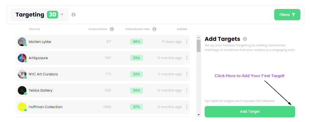
Targeting works the same way. Write for the person you want to help. If your carousel is for new mothers in Bengaluru, use their language, their questions and their examples. A narrow, useful post often gets better saves than a broad post that tries to speak to everyone.
Build a simple weekly rhythm
Consistency helps more than volume. Here is a rhythm many small creators can keep:
- One carousel a week, planned on Sunday evening with one idea and a rough slide outline.
- Two or three short Reels or single photos in the same week, so the feed does not feel like only one format.
- A 20-minute review on Friday or Saturday: read the numbers from the week's posts, note one thing to repeat and one to drop.
Do not copy someone else's schedule without testing your own. Your audience, time zone and free time decide what is sustainable. A steady carousel every week you can keep is better than a daily plan you stop after two weeks.
Frequently asked questions
How many slides can an Instagram carousel have?
The Instagram app and web let you share up to 20 photos and videos in one carousel post, according to Instagram's Help Center. Some third-party scheduling tools and publishing routes allow fewer, so check the limit before you plan a long carousel.
Do carousels get more reach than single photos?
Nobody can promise that. Carousels can earn more saves and more time on a post because people can read through them. Track reach, saves and shares for your own posts and compare the formats over several weeks.
Can I put a Reel inside a carousel?
You can include videos in a carousel, but those videos are not Reels and do not appear in the Reels tab. If you want reel-style discovery, post a Reel on its own.
What should go on the first slide?
Use a short, clear promise or question that tells the reader what the post will give them. Keep the text large and easy to read on a phone. The first slide decides whether anyone swipes, so spend the most time on it.
Should I use hashtags on carousel posts?
A few specific hashtags that match the topic and your city or niche are usually enough. Long lists of broad tags can bring the wrong viewers and make the caption harder to read.
How do I know if a carousel worked?
Look at saves, shares and reach, then compare those numbers with your usual posts. One post is not enough to decide. Track six to eight carousels before you change your whole plan.
Your next step
If you want to try a carousel on a real account, start with one idea, five slides and one clear caption. Track reach, saves and shares in your sheet for the next two weeks. When you want to test a small order on your own terms, the free trial page lets you try 10 followers first. You can read more on the Kicksta.in Instagram growth blog, browse our services when you are ready to compare options, or make a free account at Kicksta.in to see your order dashboard and support tickets in one place.